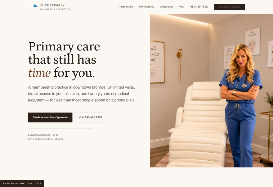
The Room
Your treatment room is warm cream, gold and wood — and your website paints it corporate blue. This direction takes the palette from the space you already built. Calm, unhurried, expensive without shouting. The practice reads as medicine first, aesthetics second.
Open direction 01 →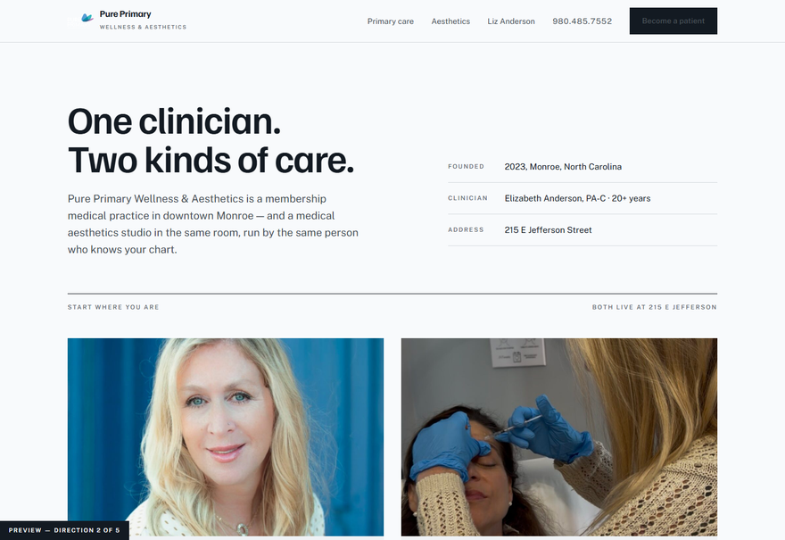
Two Doors
You run two businesses under one name, and they sell to two different people in two different moods. Instead of blurring them, the page forks at the top — primary care one way, aesthetics the other — using the teal and orchid already inside your own logo. Clear, organised, competent.
Open direction 02 →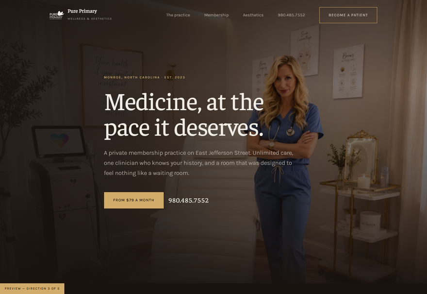
After Hours
Your room with the lamps on. Deep warm espresso, brass, big photographs and very few words — the register of a small private club rather than a clinic. The most differentiated of the five, and the one that best supports premium aesthetics pricing.
Open direction 03 →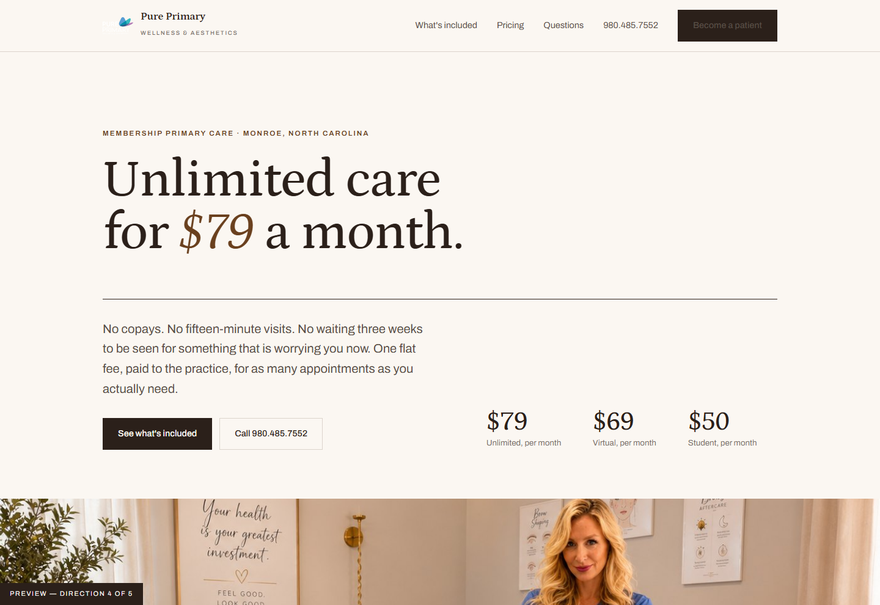
The Case for $79
Same identity as Direction 01, but it leads with the number and then proves it. Built for the visitor comparing you against their current doctor — what the membership actually buys, then the questions everyone asks before joining.
Open direction 04 →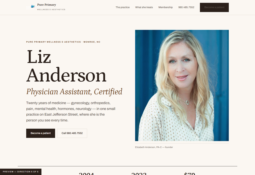
The Clinician
Same identity again, organised around you. In a one-clinician practice the clinician is the product, and twenty years across eight specialties is the one thing no competitor in Monroe can copy. A magazine profile that happens to sell a membership.
Open direction 05 →